Thursday, 9 January 2014

Amir Chasson discusses the value of bad reviews, being stubborn and selling artworks for £2.99.


Amir Chasson treats the art critic of the Evening Standard’s lacerating comment about his paintings at the Saatchi Gallery as a triumph. ‘When I knew I was going to be in that Saatchi exhibition, I assumed Brian Sewell would review it and I was worried I wouldn’t be mentioned. He said that my work looked like a Sunday painter’s, an amateur from Ponder’s End. That was great. I didn’t get enough bad reviews. Sewell giving me a bad review is a great accolade. A lot of artists don’t get reviews good or bad, none at all. Indifference is what’s painful. No reaction is what hurts. A bad review is as good as a good review.’ Chasson’s response to such a potentially demoralising comment in print is surprising and almost incredible but he is defiant, translating adversity into advantage, displaying some of Andy Warhol’s inverted logic.

What riled Sewell are Chasson’s imaginary portraits resembling caricatures or cartoons. Exhibited in a show called ‘New Order: British Art Today’, Chasson aligns these exaggerated faces beside diagrams of indeterminate graphs, maps and bar charts. Eyes are lopsided and noses curve out of perspective. They begin to resemble those Victorian heads illustrating the science of phrenology that attempted to reveal intelligence or degeneracy in the shape of a skull. These faces are discomforting in their collapsing details. The simulated diagrams allude to rationality but are paradoxical fictions awkwardly meeting in paint. Chasson seems drawn to that friction between our faith in concrete information and the subjectivity of both making and looking at a painting.


Chasson greets me at his studio in a building run by Acme, offering warm and affordable space to artists, so different from the romantic myth of ramshackle attics.  The studio is surprisingly tidy even though he shares it with another artist. Large canvases from past exhibitions are rolled up inside tubes and several unfinished paintings are hung along the walls. Wearing a pair of modish glasses he has the appearance of an educated, urban professional. He is on a roll now, on the cusp of wider recognition and new opportunities, positioned where every ‘emerging’ artist wants to be, showing work in exhibitions, being reviewed and finding recognition.  

Chasson remembers the process of entering the notorious Saatchi Collection as rather impersonal and never discussed the sale with his influential patron. The ICA, then hosting ‘New Contemporaries’, simply called him and said ‘off the record’ that ‘Charles’ was interested in buying the paintings and would he mind? Being bought and exhibited by Britain’s leading collector of contemporary art, Charles Saatchi, might represent a defining moment in an artist’s career. Damien Hirst and Tracy Emin are proof of that. Amir Chasson demurs but concedes that it’s helpful in getting noticed and reviewed. ‘I don’t know how valuable it is. My initial response was, oh great, I’m going to make some money from that show. I didn’t even know he would show the pictures. I swear I didn’t even look at the Saatchi website. You don’t do that as an artist, you just don’t. You have to keep thinking about the next painting. You can’t keep thinking about what you did before. Your reference points are your friends and colleagues, people you studied with, those you look up to.’ He seems grounded enough not to get carried away by this lucky break, but confesses ambivalence about the process. ‘Sometimes I get this feeling it’s not prestigious anymore to be in the Saatchi, but of course I would be happy to sell more paintings to him.’

This begs the question how comfortable he is with success and what really drives him. He offers that ‘it’s very hard being an artist in London,’ which seems a truism and I press him to elaborate. Does he mean financially, professionally?  ‘Yes, of course, all of that. Financially, you can deal with it by freelancing, sharing a studio, by working from home. The greatest difficulty is the intellectual, psychological challenge of who am I in this crazy, insane, saturated, money-driven world. All the other things, health, money, wellbeing comes later, if at all. Because when you make artwork, all that goes out of the window, none of that matters.  When you are in the ‘zone’, finally in the studio and have ideas and are executing them, then it’s a high, a sort of happiness, it’s where you need to be like being in the womb.’

He talks with animated conviction while his hands appear still and controlled.
After many years working as a graphic designer and teacher in Tel Aviv, he seems to have found his direction and a professional integrity by his mid-40s . Compelled to take an MA in design by the college that employed him, he researched Hebrew typography by distributing questionnaires in the street. Surely, it had a practical application for communications? ‘I hated every minute of it and decided it was pointless but somehow they liked it. It was the equivalent of why English readers might prefer the fonts, Times New Roman or Helvetica.’

Chasson is a curious iconoclast, teasing established orthodoxies from masculinity to the art world itself. He recounts persistent alterations of any commercial brief or syllabus.  ‘I have always had a subversive streak like Marcel Duchamp, one of my heroes at school like many artists nowadays. I was always attracted to how he makes fun of science and makes science ridicule itself.’ In early, animated films, made in Israel, which he now calls ‘a bit silly’, he took risks by satirising military heroes or putting Arab lettering over posters celebrating the anniversary of Israeli independence. Even more provocative was the use of Palestinian propaganda. ‘Guy, my partner and a journalist, used to travel to the West Bank and bring back little postcards that showed ‘shaheeds’ or heroes, which will probably be shocking for some Israelis. They did some horrible things obviously like exploding themselves on buses. But that’s an example of the source material I was using.’ Machismo remains an enduring interest. During his residency in Rome, he made a very large painting merging images of a heavy marble head in the Capitoline museum with muscular actors posing as gladiators outside the Colosseum and young Romans sweating inside Goth clothing on the street.


But how did his finally find his groove and ideas that could engage him? He credits his testing training at Goldsmith’s College, which helped him find a subject and a method, despite his initial fears that the course was too pretentious and reliant on theory. On this point he is emphatic. ‘It was amazing. Studying there put everything in context. I know it sounds ridiculous. But there’s no way you can become an artist without going through an education. Painting at Goldsmiths, the year I was there, was a no-go zone. To use a politically incorrect term, it was ‘retarded’.’ So there was no respect for your roots in drawing or what he wanted to do? ‘I loved being there with all my heart but the approach was to tear down all you knew and build you up by starting again. When I started I was 39 but most were in their twenties. I needed to be more stubborn. Then some drawings got accepted by the Jerwood Prize and Bloomberg New Contemporaries in 2009, which was the biggest ‘fuck you’.  I had made a massive drawing called ‘Piss Pants’, a figure with a big stain on a pair of jeans. I was thinking about when people actually piss themselves, when they’re drunk or scared. The tutors gave me an ‘unsatisfactory’ grade. That was good, it pushed me and I started making videos. I resisted but they pushed me really hard and it worked.’

How Chasson arrived at making the Saatchi series illustrates the role of chance that characterises any artistic career. Having tried to isolate single words like ‘sameness’ or ‘prolix’ he kept running into the challenge of making a painting that held the viewer’s interest. ‘I thought that people are really indifferent to those words, nobody cares or gets it. Then I realised one of the most attractive things for people that makes them stop is a portrait. The human face is like the colour red, it gets your attention. I thought that’s a great tool for waving the cheese in front of the mouse. I had never painted a portrait before. Then I heard the name ‘Ipswich’ on the radio and not being from this country it sounded ridiculous and I copied a Picasso pencil portrait, as I wasn’t confident enough to work from life. It’s a big responsibility to work with a live model. I put the word Ipswich around it and I knew immediately that it was working. ‘

Later, he would use the same strategy of sampling found images, attributing the portraits to ‘composites like police software faces. I go through magazines or online images. One of the Saatchi paintings has the hair of a pop star, the shirt of a rugby player and one has the face of an Ingres woman. There’s no real balance. God forbid it’s balanced. The dissonance is what I’m after.’  To heighten the alienating effect of these portraits he often introduces the hint of a skin condition. More recently, in a large installation he painted a fictional group of oil and gas executives, suggested by corporate prospectuses of large multinationals.  ‘Corporate people sometimes look crazy – it’s more intense because it’s not normal for them to be in front of the camera, they are usually behind the scenes. They are putting themselves out there.’

This unconventional streak still persists in the artist’s attitude to the art market, which he describes as having become an industry. He shows me a limited edition he made for an exhibition in Norwich made from a cereal packet which unfurls, like a crack in a door, to reveal a middle aged man turning around to admire the back and buttocks of an anonymous, naked man. I glance at the price and see ‘£299’ which seems reasonable. I squint again at the small print and see that each piece actually sold for £2.99 despite the gallery’s misgivings that art was almost being given away for free. Ever the maverick, Chasson insisted that this witty collaging of found material should sell at the cost price of the original cereal on a supermarket shelf.

He makes several references to critical theorists like Derrida and Baudrillard as sources of inspiration but acknowledges that he doesn’t take them too seriously, merely using them as starting points for ideas that he incorporates into artworks.  Does the viewer also need the same kind of education in theory to understand much of contemporary art? ‘No, not necessarily, if the work needs theory from outset then there’s a problem. But if it succeeds then an artwork can sit on a pile of theory without there being a problem. Peter Doig makes good eye candy, it’s great but if you discover there are ideas behind it, what’s wrong with that? The Desmoisselles d’Avignon by Picasso is so brilliant because his process was so random. Most art arrives out of random processes. This is what artists are supposed to do. Picasso creates a picture like a poster, addressing life, death and sex and he needs ambiguity otherwise it becomes like propaganda. Popular culture doesn’t have ambiguity. That’s why I failed as a commercial artist. You’re supposed to feed people a message.’

Possibly breaking the conventions on good journalism, I ask if I could buy a painting. I point enthusiastically to his latest project, an unfinished double panel painting on which the word ‘Gene’ is spelled out in a confectionary colours and bubbles. Gene Clark from the Byrds is placed inexplicably opposite a dinner party hosted by the German revolutionary, Rosa Luxembourg. Chasson starts to shift in his seat and look uneasy for the first time. He doesn’t want to disappoint me. ‘Right now, I need it for some new exhibition proposals. I will keep you in mind.’ I’ve introduced the subject of value into Chasson’s sanctuary, the place where he finds his ‘zone’. Gradually the tension dispels as he shows me other examples of his work in the studio. If paintings don’t sell, he will simply paint over it. Again, it seems rather defiant and practical at the same time.

Before I leave, he offers me shortbread from an unopened packet on the table. ‘I bought it especially for you,’ he says with a smile as I hold the cellophane wrap and feel the sticks inside. I hesitate as I explain that I’ve given up eating wheat but relent to avoid appearing faddish or churlish. Tentatively, I snap off a piece to nibble. He smiles solicitously, eager that I should enjoy myself. I feel naughty breaking the discipline of my diet but fully appreciate the sweet, buttery biscuit. Amir Chasson seems to make breaking rules rewarding and even necessary.


'New Order: British Art Today' runs until January 16, 2014 at the Saatchi Gallery, London.

Friday, 15 November 2013

An Interview with the American artist and photographer, Philip-Lorca diCorcia.

Iolanda, 2011 ©Philip-Lorca diCorcia


Working in the space between documentary and staged photography, Philip-Lorca diCorcia recently exhibited a new series in London, ‘East of Eden’, at David Zwirner in London. The title alludes to John Steinbeck’s epic novel published in 1952 and biblical parables found in the Book of Genesis such as Cain and Abel. While explaining how the project originated and evolved, Philip-Lorca comments on the Bush Presidency, the economic crisis and the state of art photography today.

JW: How did ‘East of Eden’ emerge and develop as your latest project?

PL dC: It started as a reaction to the economic bubble that burst and people’s conception of the world and the possibilities that had once existed.

JW: The gallery’s press release refers to impact of the Bush presidency.

‘East of Eden’ refers to the end of the Bush presidency and the wars that were futile and misconceived, the economic situation and the stock market being at an all time high, everyone leveraging themselves to death and mortgages being given away. All of that. There was a sense of delusion in the whole thing and knowledge came with the collapse of everything. The apple in Adam and Eve represented knowledge. They call it the Fall and the expulsion. The president had lied to you and all these people had lied. I felt that there was a certain analogy that serves as a jumping off point and obliquely refers to the shocking change that followed.

JW: This underlying political sense of the time we’re living in is not necessarily explicit in scenes of an ordinary house such as ‘Mount Ararat, Pennsylvania’.

PL dC: I was attracted to the scene because it happened to have that name but there you have some windmills and it’s in an area of Pennsylvania where they do fracking, which is very contentious. I ended up with the opposite of fracking. If you take out the windmills, this picture wouldn’t be there. It’s like the invasion of technology, ‘The War of the Worlds’. It must look extremely American to a British audience ­– the American flag and the lack of people. I’ve been involved in a bunch of Edward Hopper projects before. There are hardly any of my pictures before that don’t have people in them. This architecture epitomises middle class of America, which everyone talks about, but I’m not sure who they actually are.

JW: Was this a new turn or interest?

PL dC: No, there’s an implicit event in the photograph. One of the things that I always like about Edward Hopper is almost about what you don’t see. Something may happen before or after. I was trying to create the same effect in some of the other pictures like Stockton, California’ with the scorched fence. One is on the East coast and one is on the West Coast. At the time I didn’t know it, but it was the first town to go bankrupt, but I didn’t know that at the time. There was one thing that really bothered me and I couldn’t deal with it so I put in this huge piece of concrete. It’s not very much.

JW: So you do allow yourself some licence to manipulate the image with digital processes?

PL dC: Some of these photographs are made with view cameras so at first you see an upside down image within a grid. You can move things up and down. I have never taken a picture just holding a camera. I never just take a picture holding a camera. I always put a camera on a tripod. I combine it with using a Polaroid for preparation so I know where everything is. Sometimes I can’t know how to resolve it. I’m stuck against the wall. I don’t have a hundred million lenses like a Zoom. In the past a view camera was used to correct perspective. I use a level on top of the camera so it’s level front to back, right to left. These lines are all parallel to the picture plane.

JW: So there’s an aesthetic judgement involved when you’re composing, processing and editing the picture?

PL dC: I’ve always been a person who uses the environment to reflect the psychological and narrative content. I remember photographing my series, ‘Hustlers’. I’d give the sitters a Polaroid once in a while and I might see them later on the street and someone would ask ‘is this guy alright?’ and he’d reply that I’d taken their picture earlier and pull out the polaroid and he’d cut his head out. The rest of the picture was irrelevant.

JW: When you were making this new series were you conscious of thematic links?

PL dC: It was a five-year project and I did look for specific things. I looked for fires, not necessarily as a reflection of some apocalypse, but yes.

JW: There seems to be an underlying tension or anxiety in some of the photos. Some of which you appear to stage and some of which seem incidental like the fallen gravestone in ‘After The Fall’.

PL dC:  You can’t read any of the names on the tombstones. Some of the gravestones are blurred so you can’t see anyone’s name. It was taken after a hurricane, which knocked down the tree. I didn’t go looking for this, though I had my camera. My father is buried there and I hadn’t been back since his funeral in 1980. I don’t really understand this one to tell the truth. There’s something about the logs…the light was clearly dramatized by the time of day and the season.

JW: There are two works connected by sight and blindness, ‘Andrea’ and ‘Lynn and Shirley’

PL dC:  It started out when I was told that blind people can’t dream. They don’t have any narrative because they don’t have an image bank. Andrea doesn’t have the possibility of seeing colour or light because she was born without an optic nerve. I don’t know what Lynn and Shirley meant to me, Adam and Eve, white and black. They weren’t born blind. I connect these things very loosely. He was shot in the head and she has macular degeneration.

JW: Did you have to win their trust? Is that how you work?

I visited Andrea. My sister teaches special education and her colleague has two blind kids with the same condition. I thought of Andrea as the anti-Eve. Today everyone would accept that Eve would be a fashion model like the pregnant model in ‘Cain and Abel’.

JW: Does Cain and Abel bear any relationship to surrogacy? It seems to possess the richest possibility for narrative in the exhibition.

PL dC: I threw everything at this image. This was the last one I made and I really went for it. The guys on the bed don’t know her and I don’t normally photograph naked women. I do a few things that I don’t normally do like take the belly button out. Eve didn’t have one because she was born from a rib. It’s Cain and Abel but actually a gay couple. I meant it to be ambiguous. You don’t know if they’re fighting or hugging but I didn’t succeed because everyone thinks they are embracing. They were quite shy of the camera. It was quite a difficult shoot. The space wasn’t very big enough and a bit too much with the ‘mod cons’, but it had dramatic like elements like the floor being so reflective and the pregnant model wasn’t shy. ‘The Hamptons’ is named after the fashionable area of Long Island outside New York and has a humorous quality with two dogs watching television inside a living room This is the most popular picture. There’s nothing depressing about it. It was taken in the Hamptons and represents to me the character of the place. It’s actually taken in the home of the person who publishes my books, Pascal Dangin, who made the prints in the show.

Cain and Abel, ©Philip-Lorca diCorcia

JW: Sometimes you’ll invite fiends and family to model in the photos. Can you explain how that happened in ‘Iolanda’?

PL dC: The model is my mother-in-law. I was given a commission to do anything I wanted for the 75th anniversary of Coach, the handbag company. ‘Iolanda’ was taken in a hotel where the rooms cost $600 to $900 dollars a night. So I did other pictures in the room with other models. To cover my ass, I put a handbag in shot and I forgot to digitally remove it. I was too busy trying to add a tornado on the television screen. The picture is made a success by her reflected face being distorted by the passing ferry. These things are manipulated. You would never have seen her face in glass without digital alteration though I still don’t use a digital camera. When I first started working in fashion photography I made an effort to hide the lights and someone said  ‘you can take them out later’! I don’t like the way that digital images look. The Hustlers series in New York are made by scanning and manipulating my old negatives on a computer and then printing from the resulting 8 by 10 negative to produce a C-type print.

JW: I’m struck how ‘Abraham’ shows a younger person being put on the defensive. Is this connected to recent wars? It’s quite threatening with the dart flying at the teenager’s face and he seems genuinely startled.

PL dC: He was. He’s going to try to stick his hands up. That’s my son and that’s my hand. People remark that we have the same hands. I really was throwing a dart at him. I put gaffer tape on the tip so it wouldn’t puncture him!

JW So these photographs emerge out of a whole variety of ideas and experiences? You don’t seem to have a particular strategy that you stick to.

PL dC: I thought of ‘Epiphany’, the pole dancer, as Lilith or the snake slithering down the tree. I went specifically out to LA and I had a connection to find this woman who I had seen before. She’s suspending herself from the mirrored ceiling, which is very difficult to do. Lilith, Adam’s first wife in Jewish folklore, is sometimes described as a snake. Unfortunately for this series, ‘East of Eden’, most people think the image is connected to an earlier series I made of pole dancers but those earlier photographs have no context.

JW: ‘Sylmar, California’ uses a particular Californian light to create a Reaganesque image of a cowboy on a horse. It has that mythic quality of settling the west taken against a tragic, burnt landscape.

PL dC: The landscape is very barren after a fire but the trees are not black and are still green. There’s a lot of beauty in tragedy. That’s the thing about California, it’s constantly on fire. In ‘Lacy’, the model asked me what I wanted her to wear so I looked at what she had and realised that the place was charred like that, I chose a dress with flowers. I guess she has a nostalgic look and she also happens to be a pole dancer.

JW: How do you now view the Hustler series made in Los Angeles over 20 years ago and recently exhibited at David Zwirner in New York?

PL dC: It’s one of my first and favourites series. It took place during that AIDs period. I happened to know a lot of people who died including my brother. I was fed up with ‘hip’ New York. I was never actually that ‘hip’ although I was playing in a band. Twenty years later there has been a homogenisation of culture. People are very cynically using youth brands or street styles and in a year turn them into something you see in every city of the world. Take Supreme the brand, for example, which used to be a skateboard company.

JW You’ve just had a big exhibition at the Schirn Kunsthalle in Frankfurt. What was your experience of mounting a large retrospective?

PL dC: Back off from the word ‘retrospective’. It did not include significant projects that I’ve done. Because of the nature of museums and money now they more or less have to borrow everything. They are not going to produce the work for the show. So what they can put in the show is determined by what they can borrow. If I were to call something a ‘retrospective’, I would say it has to be inclusive and selecting the images that they want rather than what they can get. I would call that exhibition in Frankfurt a ‘survey’. It’s moving onto the De Pont in the Netherlands and then to the Hepworth Gallery in Yorkshire.

JW: So are there some challenges with putting on a museum show?

PL dC: It’s not that I produce so much work but in terms of square footage there are things, for instance, the ‘Storybook Life’ shown at the Whitechapel Gallery in 2003 as one work. It’ s the whole thing, not a single image, which takes up a lot of installation space. In the case of the De Pont in the Netherlands they decided to do a thousand images running 351 feet in one long row. It was first shown as a single line at David Werner, in New York, they exhibited the series laid out in a spiral. It was clearly laid out and people really did move in the order they were shown. That was the most successful iteration.

JW: D you think Photography is being determined by fashion?

PL dC:  I don’t know. Photography has lost some of its lustre in the art world. People want unique objects. I don’t think it’s a coincidence that when photography started to be less prevalent, it became exceptionally abstract or extremely conceptual. The work people want on their walls…. I’ll just say it, it’s decorating. There are all sorts of art markets. There is the one where people actually live with art and then there’s the one where it goes straight to the warehouse. If it goes straight to the warehouse, they are speculating. And the auction market for photography, unless you’re Andreas Gursky, has not been favourable.

JW: But you remain committed to photography.

PL dC:  I’m not going to change. It gets me out of the house. I could never go to a studio and dream up something because it would be irrelevant to me.

JW: What have you learnt by exhibiting this project?

PL dC:  There are two interesting questions people have asked me about the exhibition. Now that the crisis is supposedly over, do you think the work has changed its significance or meaning? The answer is simple – I don’t think the crisis is over. The other question is ‘as there are no titles on the wall do you think it’ s unfair that people have to figure out so much, even the connection of these images to the novel ‘East of Eden’ which can be completely lost. I guess my answer to that is that it’s not lost if you live with it. If you experience everything by taking a twenty-minute tour of an art gallery or leafing through a magazine then the point is going to be lost on you. My ambition has been to get beyond that. This comes partly from working for magazines and realising that people don’t even look at the damned images unless they’re naked.

JW: So the images have to be self-sufficient?


These images are not meant to be seen just in conjunction with each other and are independent of their titles. My project ‘A Storybook Life’ has no information or foreword, just the location and the date at the end of the book. In a question and answer session at Whitechapel Gallery people seemed almost angry that I wouldn’t supply them with that kind of anecdotal information, something to say that’s my brother or this happened. People really want that from photography. They want the Nan Goldin experience, 'this is my world' ­– or a cool lifestyle. ‘I’m Wolfgang Tillman and I don’t live like you do.’ People are attracted to that because photography has traditionally served as a document of events in your life.

Thursday, 24 October 2013

Clunie Reid's 'In Pursuit of the Liquid' at MOT International


Trawling through the thicket of cyberspace, Clunie Read has gathered a matrix of images that she loops together in four complimentary films creating one inter-connected work. These disconnected images are montaged together to suggest a narrative but explicitly carry a random, discordant quality. Watching these four films on individual screens placed half a metre above the floor requires climbing onto four rubber air-beds low down on the floor producing both physical imbalance and discomfort. Such furniture alludes to the makeshift world of private, party spaces.

Onscreen, animated sequences, including footage from the smallest stop-motion film ever made, are mixed together with avatars and icons taken from surfing and sampling across cyberspace. The flow is erratic and jumpy as material accelerates and then fades away. Exaggerated false breasts collide with jumbled gaming icons, dollar signs, hearts, written instructions and pixelated figures. Clunie unleashes a flood of vulgar sexual and commercial titillation, resembling an online ‘wild west’, a dystopia of frustrated promise, desire and freedom. Blending the innocent with the decadent, Reid explores the collapse of certainties around the invented and the real, between fantasy and fact.

This project follows on from her prior use of drawn and collaged material, derived from similar sources. Now she employs film to lend a jittery effect where the images appear locked together in a sequence that both mirrors and disrupts our experience of ‘hyper-reality’. ‘In Pursuit of the Liquid’ has a formal slickness that nicely instils a twitchy anxiety in the viewer. Our hopes and fears within virtual reality are directly addressed. In an age where we find it increasingly difficult to separate experience from the imagination, chaos arises out of technical progress. Cyberspace becomes a place of experimentation and transgression detached from responsibility. We are seduced here into a dysfunctional value system of instantaneous gratification. ‘In Pursuit of the Liquid’ exposes this rather enticing but sordid proxy world to scrutiny, however the films’ raw insistence and repetition tend to diminish the satirical and critical effect.

Wednesday, 21 August 2013

John Armleder's 'Quicksand' at the Dairy Art Centre


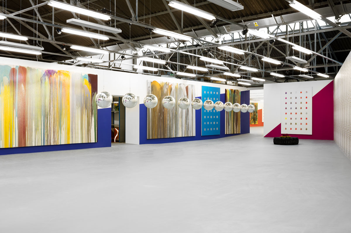
Hidden down a narrow lane off an old cemetery in Bloomsbury, two prominent collectors Frank Cohen and Nicolai Frahm have opened a new public, non-profit exhibition space this summer called the Dairy. Named for its former role as a milk depot, the cavernous warehouse lends itself well to the type of large-scale work and installations on show in this opening exhibition of work by the Swiss artist, John Armleder. He is associated with the improvisational and performative Fluxus and rejecting institutional or commodified art. Armleder is instinctively transgressive. Wallpaper and painted walls compete with hanging paintings made by splashing and pouring paint, resin and glitter across canvasses. This is not the intuitive expression of Jackson Pollock or the formal experimentation of British Painter, Frank Bowling, but an attempt to challenge that urge we have to categorise art in order to seek some certainty.

Armleder is an active curator of his own exhibitions and this is evident at the Dairy. He enjoys mixing the work up so that aspects of interior design muddle the distinctions. Walls are painted with stripes and 12 disco balls (Global Tiki, 2000) hang from the ceiling in a diagonal progression across the gallery. Plants sit within makeshift beds made from old tyres that replicate planting in the yard outside. Boundaries collapse and the gallery becomes a theatrical set in which viewer becomes performer.

In the ‘fridge’, Armleder has built an installation from metal shelving stacked with bric-a-brac of lava lamps, old framed photographs and stuffed animals. The explicit absence of good taste here touches on the perilous territory of class and caste. But the universal interest lies in the suggestion of domestic accumulation of stuff that threatens to physically overwhelm us. Objects also potentially carry memories and aspirations. On a sound loop, grating Hawaiian music plays its kitsch melodies as if we are stuck in Honolulu airport. Armleder also piles up old art books and magazines in a messy heap. Culture and human achievement are reduced to a stack of discarded rubbish. But it uncannily echoes that desire for distinction between what’s valuable and what’s junk. Who hasn’t struggled with that dilemma? Ultimately, everything within this installation begins to resemble a flea market of the redundant, creepy and worthless. There is the hint of mothballs, the charity shop and the hoarder.

Such a critique of materials and their associations is most explicit in a work that curls out across the floor merging metal shavings, wood logs, bowling balls, art books and sand. Comprising both the raw and the manufactured, these elements suggest formlessness and precision, functionality and waste. The pliability of materials and their myriad uses embody the spectrum of human activity but seem dumped on the floor as a levelling gesture. Perhaps the most puzzling works are paintings made from simple, repetitive designs like spiders or flowers, resembling stickers or potato prints. Paradoxically, made by the artist in a painterly process, at the same time they suggest a universal, graphic language.

In the entrance sits one of the artist’s ‘Furniture Sculptures’ a fashionable looking lacquered bar top with stools covered in various ‘lollipop’ colours. Imitating high-end design, the ‘sculpture’ doubles up as counter you might find in a fashionable bar, but the piece maintains Armleder’s frustration of clarity – for most of the time it is an inviolable sculpture to be gazed at.

Armleder’s work is intentionally provocative and wilful. Formally diverse and inconsistent, the exhibition conveys the playful intentions of an artist first emerging from the 1960s. Conceptually, the work is quite robust as Armleder consistently resists a singular ‘style’ or subject.  He quotes art history while turning materials and objects upside down. Irresolution is the prevailing theme. You’ll discover an exhibition packed with subversion, where teasing contradiction becomes a value in its own right.